GetApp offers objective, independent research and verified user reviews. We may earn a referral fee when you visit a vendor through our links.
Our commitment
Independent research methodology
Our researchers use a mix of verified reviews, independent research, and objective methodologies to bring you selection and ranking information you can trust. While we may earn a referral fee when you visit a provider through our links or speak to an advisor, this has no influence on our research or methodology.
Verified user reviews
GetApp maintains a proprietary database of millions of in-depth, verified user reviews across thousands of products in hundreds of software categories. Our data scientists apply advanced modeling techniques to identify key insights about products based on those reviews. We may also share aggregated ratings and select excerpts from those reviews throughout our site.
Our human moderators verify that reviewers are real people and that reviews are authentic. They use leading tech to analyze text quality and to detect plagiarism and generative AI.
How GetApp ensures transparency
GetApp lists all providers across its website—not just those that pay us—so that users can make informed purchase decisions. GetApp is free for users. Software providers pay us for sponsored profiles to receive web traffic and sales opportunities. Sponsored profiles include a link-out icon that takes users to the provider’s website.
What Are Data Visualization Techniques, and How Can They Power Up Your BI Game?
Data visualization is the key to actionable insights, goal tracking, and growth. But effective data visualization relies on the right data visualization techniques.


If you're a small business leader seeking to master the art of data visualization, it's crucial to choose the best technique that is engaging, memorable, and intuitive in order to spark action from your audience. In this article, we'll explore what data visualization techniques are, the benefits of using them effectively, and how to select the right one so that business leaders can get the most out of their business intelligence (BI) software.
To get this advice, we spoke to two experienced business leaders–Ricardo Pina of The Modest Wallet and Franco Moiso of Cushman & Wakefield–about how they’ve learned to maximize data visualizations in real world business situations over the years.
“Some of the most successful business owners and executives find it challenging to comprehend more than a pie chart, bar chart, or other cleanly presented visual, and they lack the time to thoroughly analyze data,” Pina said. “One of the most important data visualization techniques is to make sure that your material is both exciting and appropriate for your audience.”

Ricardo Pina, founder of The Modest Wallet (Source)
“The key for me is to understand beforehand what the storytelling of the presentation is going to be,” Moiso said. “You should not show data just for the sake of it. It needs to have a purpose and a meaning.”

Franco Moiso, managing director at Cushman & Wakefield (Source)
If your team hasn’t yet adopted data analytics software and want to learn more about bringing business intelligence into your operations, you can start here instead.
What are data visualization techniques?
Data visualization allows business intelligence software users to present data findings graphically through charts and graphs. The goal of these visualizations is to highlight specific patterns or trends in a way that allows the audience to quickly and clearly understand the insight being presented.
Different data visualization techniques include—but are not limited to—pie charts, bar charts, line charts, heat and tree maps, geographic maps, scatter plots, and other custom-designed visuals. Interactive data visualization allows users to manipulate these graphics in order to explore the data further beyond the original scope of the data visualization creator.
Learn more about interactive data visualization here.
Why do you need a new approach to data visualization?
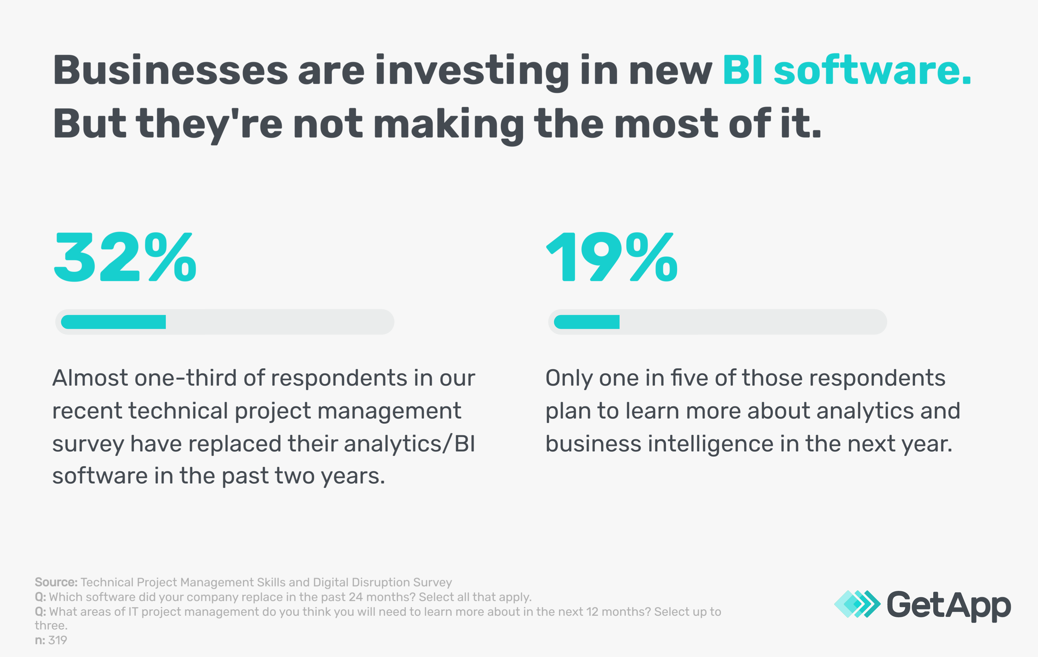
Our recent survey of IT project managers (methodology below) found that 32% of respondents have replaced their analytics/BI software in the past two years, but less than 20% of these respondents think they need to learn more about business intelligence and analytics in the next year. We feel strongly that this is a flawed approach and will result in teams missing out on the full value of their new BI software.
Whether you work in IT or another business function, making the most of your software investment is always a good idea. In the context of business intelligence software and data visualization, this means optimizing each visualization for the audience by delivering data insights in the simplest, most straightforward format possible, and always being mindful of the bigger data story that your visualizations support. This extra attention will pay off in the form of more impactful, resonant insights, better team communication, more accurate goal tracking, and organizational growth.
What are the benefits of effective data visualization?
When used effectively, data visualizations can yield these benefits and more:
Socialization. Effective visualizations that are easily understandable and organically encourage stakeholders to take action based on data insights are likely to be shared across teams and the wider organization, creating a ripple effect.
Engagement. Interactive visualizations, like those included in interactive dashboards, encourage users to not just view data insights passively, but to think critically about what they’re interacting with and investigate further.
Comprehension. Over time, effective data visualizations can help the audience connect data insights to bigger trends, relationships, and patterns. This benefit can be amplified when teams aim to collect their data insights into larger data stories.
Stickiness. Stakeholders are much more likely to retain and spread information when it is presented with an effective data visualization. This also connects back to the first benefit, socialization, when these visualizations are retained and redistributed across teams.
How to get started with data analytics and BI (Source)
How can real business leaders pick the right data visualization technique?
Before we get into specific charts and graphs, let’s look at some general tips for selecting the right data visualization technique for the right situation.
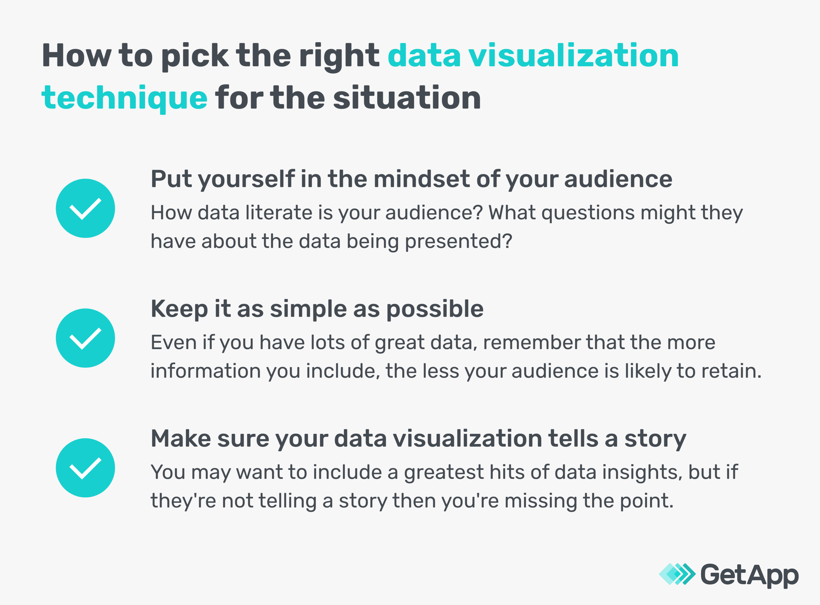
Before choosing a data visualization technique, put yourself in the mindset of your audience. How data literate is your audience? Do they have experience in analytics and business intelligence, or do they have more of a background in marketing or finance? What type of questions do you anticipate them having about your findings? This information will help you determine the right type of visualization technique you should use. A scatter plot might be great for an audience of analytics leaders, but a bar chart might make more sense for a marketing team.
“Make sure that your material is both exciting and appropriate for your audience,” says Ricardo Pina, founder of The Modest Wallet [1], a personal finance website. “A straightforward pie chart will satisfy certain clients and partners or stakeholders inside your company, but others will expect you to go more into the data you've acquired. Prior to a meeting, you should always do some research on the audience you'll be speaking to, compile your report, and make sure your graphics and level of detail are exactly what they're looking for.”

Ricardo Pina, founder of The Modest Wallet (Source)
Here are a few more ideas to help your data visualizations meet your audience’s needs:
Before a presentation, email your audience with key findings and ask them to respond with any questions.
Experiment with multiple data visualizations using the same data and ask others on the BI team for their feedback prior to selecting a chart type.
Survey your audience after a presentation to ask them if they had any trouble understanding your charts and graphs.
When in doubt, choose the simplest chart or graphic possible. It might be tempting to cram a lot of information into your visualization, but the more data you include, or the more complex the chart, the more difficult it is to understand. Your goal isn’t to force your audience to become data scientists themselves, it’s to quickly and clearly deliver the most important information.
If you can’t decide if your visualizations are too complicated or not, share them with another team—for example, the HR or creative team—and ask them how easy or difficult they are to understand.
Make sure your data visualization tells a cohesive story. When studying your data findings, you’ll likely come across several “wow!” insights you really want to highlight for your audience. But if these highlights are unrelated to each other, you’re presenting more of a disconnected series of greatest hits than a clear data story. Think about how your data insights are connected, and then choose visualizations that show those connections.
“Knowing what you need or want to show, will inform you on what type of visualization you need,” says Franco Moiso, managing director at Cushman & Wakefield [2], a real estate brokerage, and cofounder of TheSundayGrill.com. “For example, if you are showing geographical data, then plotting data across a map can be helpful. You can add layers of data by coloring or changing the points shapes and sizes.”

Franco Moiso, managing director at Cushman & Wakefield (Source)
Don’t be afraid to include non-data graphics, quotes from relevant stakeholders, and photographs in your presentation interspersed with your data visualizations to ensure a narrative thread.
Now, let’s look at some specific types of data visualizations along with some ideas for using them effectively.
5 data visualization techniques to power up your BI game
In this section, we’ll take a closer look at five of the most popular data visualization techniques.
Pie charts. One of the most foundational data visualization techniques, pie charts quickly show how segments of data make up the whole.
Tip: When using pie charts, limit yourself to three or four data points. If your pie chart has too many segments, your audience will have trouble interpreting the significance of each segment.
Bar charts. Another foundational technique, bar charts present data on an X and Y axis. One axis typically shows different categories, while the other axis shows the measured values. The bars can be displayed vertically or horizontally based on preference.
Tip: Use a vertical layout when you’re showing chronological data (for example, month-by-month), and use a horizontal layout when your categories have long labels and need more space.
Timelines. A timeline shows a section of time, typically on a horizontal axis, with key events or milestones plotted across that axis.
Tip: Don’t feel the need to label every single year on your timeline. The point of a timeline is to show the most important events over a period of time, so focus on highlighting the biggest moments.
Line charts. Imagine the classic stocks rising and falling charts (if you need a refresher just look up the “chart” emoji [3] on your smartphone) and that is a line chart. A line chart plots data points across an axis and then literally connects the dots. This can easily show how data changes over time.
Tip: You can turn your line chart into an area chart by simply coloring in the area below the line.
Scatter plots. A scatter plot is similar to a line chart, except that in a scatter plot the dots aren’t connected. Scatter plots can show the correlation between two variables on a large data set.
Tip: A scatter plot is a great way to show relationships between two variables, but be wary of drawing relationships where there are none. For example, just because you can plot revenue against lunar phases doesn’t mean that there’s actually a connection there.
While you can create most of these charts and graphs fairly easily using any type of spreadsheet software, data visualization software—which is often included as a feature in business intelligence software–can help you boost the effectiveness of your data visualizations. Here are a few features that help do that:
Data visualization templates allow teams to save their most frequently used visualizations as templates, and then reuse them quickly and easily by swapping in new data or making minor tweaks to color coding or labels.
Collaboration tools give analysts the option to quickly and easily share their most impactful visualizations across the organization, amplifying the socialization effect. This feature can also help teams come together to work on visualizations collaboratively.
Interactive dashboards help teams pull several visualizations together in one place. The interactivity allows other users to dig deeper into the data by drilling down on specific findings, filtering out information that’s irrelevant to them, and even installing widgets that automatically import data from a specified source and update graphics periodically.
The right BI software is key to effective data visualization
In this article, we looked at how using the right technique to share data visualizations is crucial for delivering clear data communication, tracking goals and KPIs, and making sense of large sets of data.
To summarize:
Consider your audience before starting to put together any data visualization.
Make your data visualizations as simple as possible while still including the most important information.
Think about how your data visualizations fit into the bigger picture and tell a cohesive story.
This may seem like a lot to remember, but data visualization software can lighten the burden through features like:
Data visualization templates to quickly replicate commonly used graphs and charts
Collaboration tools to easily share data visualizations with stakeholders
Interactive dashboards to combine multiple visualizations in one place and allow other users to explore data findings
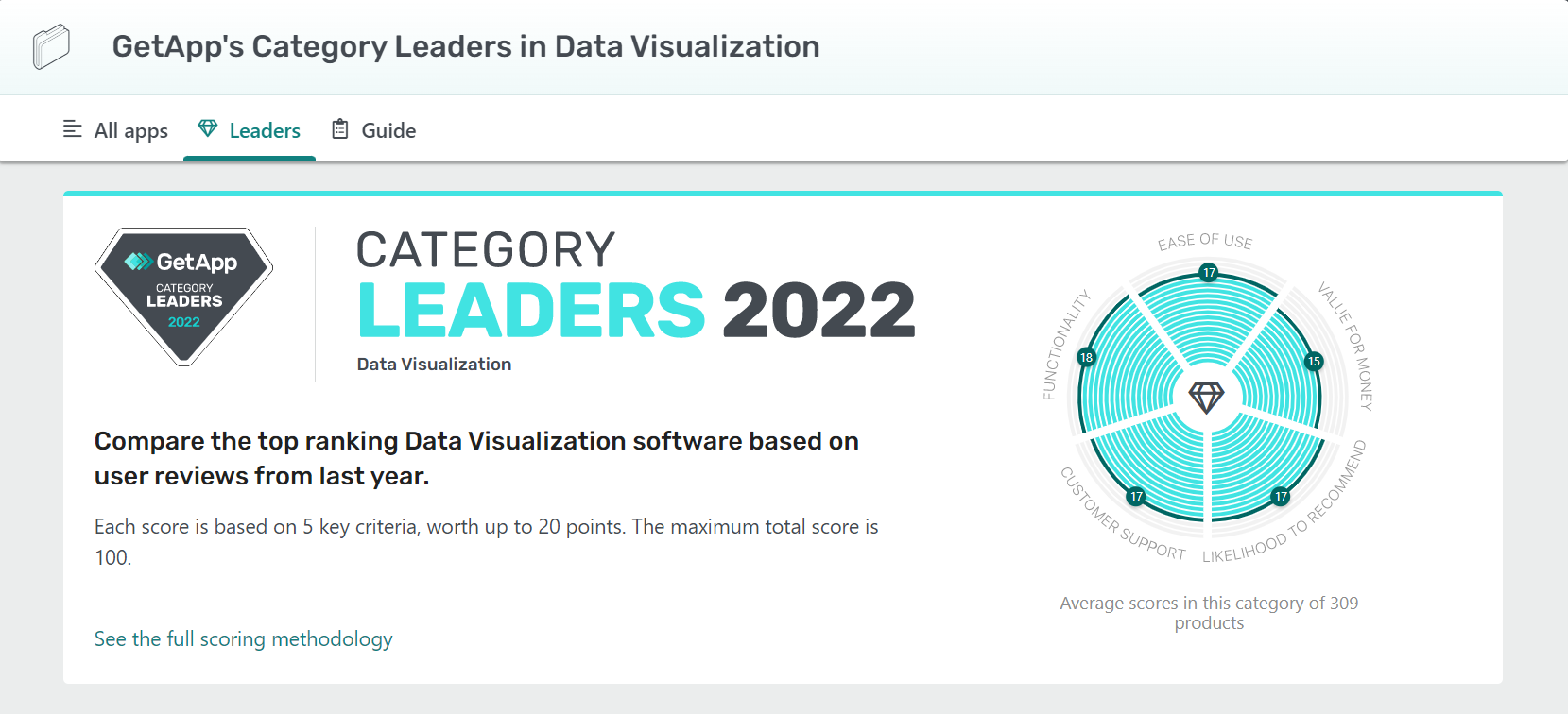
Those are just a few highlights. To learn more about the benefits of data visualization software, check out our buyers guide. Once you’re ready to explore data visualization software options, start with our Category Leaders, which features 15 top options based on verified user reviews.
GetApp’s Category Leaders in Data Visualization (Source)
Methodology
GetApp conducted the Technical Project Management Skills and Digital Disruption Survey in June 2022 of 319 U.S. project managers who've managed an IT software development/implementation project to understand how often and why software is getting replaced, the technical knowledge of PMs, and the tools/approaches they use to help their companies choose and implement the right tech. Respondents were screened for their involvement with project management at their company (very to extremely involved) and that they use a formal PM methodology.
Sources
Ricardo Pina, Crunchbase
Franco Moiso, LinkedIn
Chart Increasing, Emojipedia
As a seven-time award winner in the Maryland, Delaware, D.C. and Suburban Newspapers of America editorial contests, Andrew’s work has been featured in the Baltimore Sun and PSFK. He lives in Austin with his wife, son, and their rescue dog, Piper.
More on Business Intelligence