GetApp offers objective, independent research and verified user reviews. We may earn a referral fee when you visit a vendor through our links.
Our commitment
Independent research methodology
Our researchers use a mix of verified reviews, independent research, and objective methodologies to bring you selection and ranking information you can trust. While we may earn a referral fee when you visit a provider through our links or speak to an advisor, this has no influence on our research or methodology.
Verified user reviews
GetApp maintains a proprietary database of millions of in-depth, verified user reviews across thousands of products in hundreds of software categories. Our data scientists apply advanced modeling techniques to identify key insights about products based on those reviews. We may also share aggregated ratings and select excerpts from those reviews throughout our site.
Our human moderators verify that reviewers are real people and that reviews are authentic. They use leading tech to analyze text quality and to detect plagiarism and generative AI.
How GetApp ensures transparency
GetApp lists all providers across its website—not just those that pay us—so that users can make informed purchase decisions. GetApp is free for users. Software providers pay us for sponsored profiles to receive web traffic and sales opportunities. Sponsored profiles include a link-out icon that takes users to the provider’s website.
What Is an Interactive Dashboard?
Interactive dashboards help organizations share data insights in an intelligent, collaborative way. Learn more about interactive dashboards and how they can help your business in this article.

Imagine uncovering the key to success for your business, but then being unable to share it with decision makers across the organization. Sounds like a bad dream, right? Not if you know how to use interactive dashboards.
Interactive dashboards allow users to visualize data and share it with others, display findings through various charts and graphs, tweak queries to display different insights, and more to help drive growth. And if you’re not communicating critical data insights and KPIs across teams, you risk falling out of alignment and struggling to move ahead as different teams chase different goals.
For small business leaders that can’t afford to staff presentation teams or analytics teams with their own data visualization specialist, interactive dashboards can be crucial for sharing important data insights with key stakeholders throughout the organization. In fact, if your company uses business intelligence software, you're probably already using an interactive dashboard without realizing it.
In this article, we’ll examine interactive dashboards and share tips on how businesses can best use them to make better decisions and grow strategically.
What is an interactive dashboard?
Interactive dashboards are software applications that gather and display data in a format that can be easily shared and interacted with by users across an organization to aid decision making. These dashboards are meant to uncover and amplify key insights in the form of charts, graphs, gauges, tables, and more.
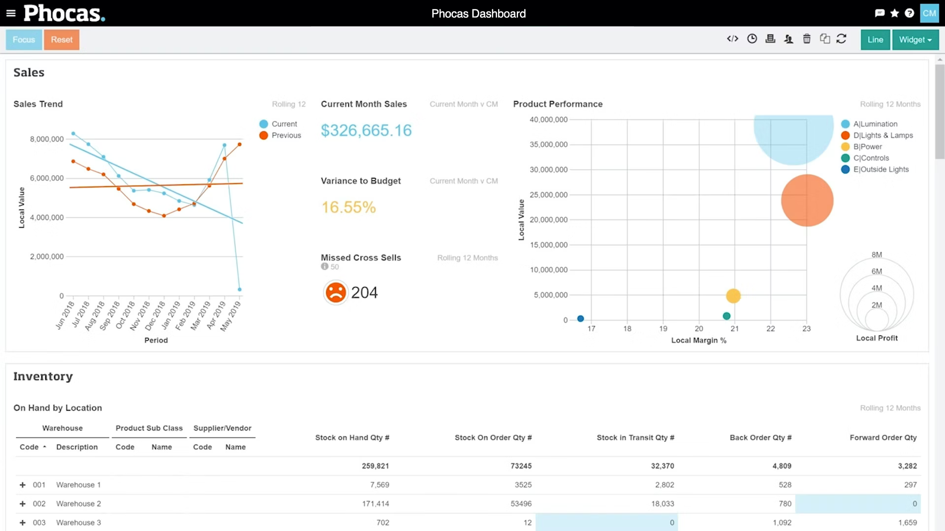
An interactive dashboard in Phocas analytics software (Source)
About a decade ago, interactive dashboards were a bit of a novelty in business intelligence software. But once this technology was rolled out, it became an essential feature thanks to the increased interactivity and ease-of-use, similar to the emergence of graphical user interfaces back in the 1980s. Now, virtually all dashboards are interactive (if your business intelligence software doesn’t include interactive dashboards, it’s probably long past time to upgrade. Check out our Category Leaders for 15 great options!).
It’s not uncommon for software vendors to include static (non-interactive) dashboards in their software. But this is typically offered as a security consideration and not as a replacement for interactive dashboards. For example, a team might want to share a dashboard with stakeholders from outside of their organization in a way that doesn’t allow the outside stakeholders to manipulate the data or access additional information. In these cases, the static dashboard option is included as an alternative to interactive dashboards, and not instead of them.
Interactive dashboard features
Now that we know what interactive dashboards are and how they work, let’s take a closer look at some of the features that make interactive dashboards tick.
Quick filters. Quick filters allow interactive dashboard users to easily change the data they’re seeing in a dashboard and then change it back to the original data without altering the dashboard for other users. For example, if an interactive dashboard shows sales numbers for all 50 U.S. states, a user might be able to quickly filter to display only sales numbers for the northeast region.
Drill down. This feature allows interactive dashboard users to dig underneath the top level of data shown on a dashboard to deeper layers. To reuse our sales-by-state example from above, drill down might allow a user to click on a single state and then see the sales numbers by city within that state.
Chart zoom. Unlike the zoom you might be used to in a photo editing app, for example, chart zoom allows interactive dashboard users to zoom in on a specific section of a chart and then see more detailed data for that section. For example, if a user is looking at year-by-year sales numbers from 1990-2020, chart zoom might allow the user to zoom in on a five-year stretch from 2000-2005 and see month-by month sales numbers for that view.
Hide cells. Hiding cells allows interactive dashboard users to select the specific data that they want to view or share with other users and then hide all the other data so that the selected data is highlighted and stands out. For example, if you have an interactive dashboard showing sales numbers for all of the salespeople in a region but you only want to highlight the numbers of your team, the hide cells feature allows you to do this.
Widgets. Interactive dashboard widgets allow users to set up integrations between their business intelligence software and other business software to automatically import data from a reliable data source. For example, a user could create an interactive widget that automatically pulls in data from their accounting software, creating monthly financial reports without having to manually pull in new data.
While not exhaustive, the features above are fairly standard for most dashboard and business intelligence software vendors.
Want to see some of these features in action? Check out this brief video walkthrough:
10 interactive dashboard features you should know (Source)
Can you make an interactive dashboard in a spreadsheet?
In this article, we’ve talked a bit about how most modern business intelligence software includes interactive dashboards. But if you’re on a tight budget, or you’re not ready to invest in new BI software or dedicated dashboard software, you may be wondering if you can create interactive dashboards through spreadsheets with software that you already have.While we highly recommend using BI software (there are even free options!) to create interactive dashboards, due to the ease-of-use and inclusion of additional features like those discussed in the section above, there are ways that users can create basic interactive dashboards in popular spreadsheet software like Google Sheets and Microsoft Excel.
In Google Sheets, this involves using the Chart feature[1], and in Microsoft Excel, you can create a basic interactive dashboard by using formulas and pivot tables[2].
This process is a little too involved to go into full detail here, but here are a couple videos that can help you create interactive dashboards in Google Sheets and Microsoft Excel:
How to create a dashboard in Google Sheets (10 steps) (Source)
How to build Excel interactive dashboards (Source)
More resources for interactive dashboards
In this article, we looked at what interactive dashboards are and how their features can help your business.
To summarize:
Interactive dashboards are crucial for sharing data insights with key stakeholders across an organization.
Key interactive dashboard features include quick filters, drill down, and widgets that automatically import new data.
If you’re on a budget, you can make a basic interactive dashboard using spreadsheet software.
The best way to use interactive dashboards is through business intelligence software. You can browse our Category Leaders for business intelligence software to explore 15 different BI products that stand out in the market based on verified user reviews.
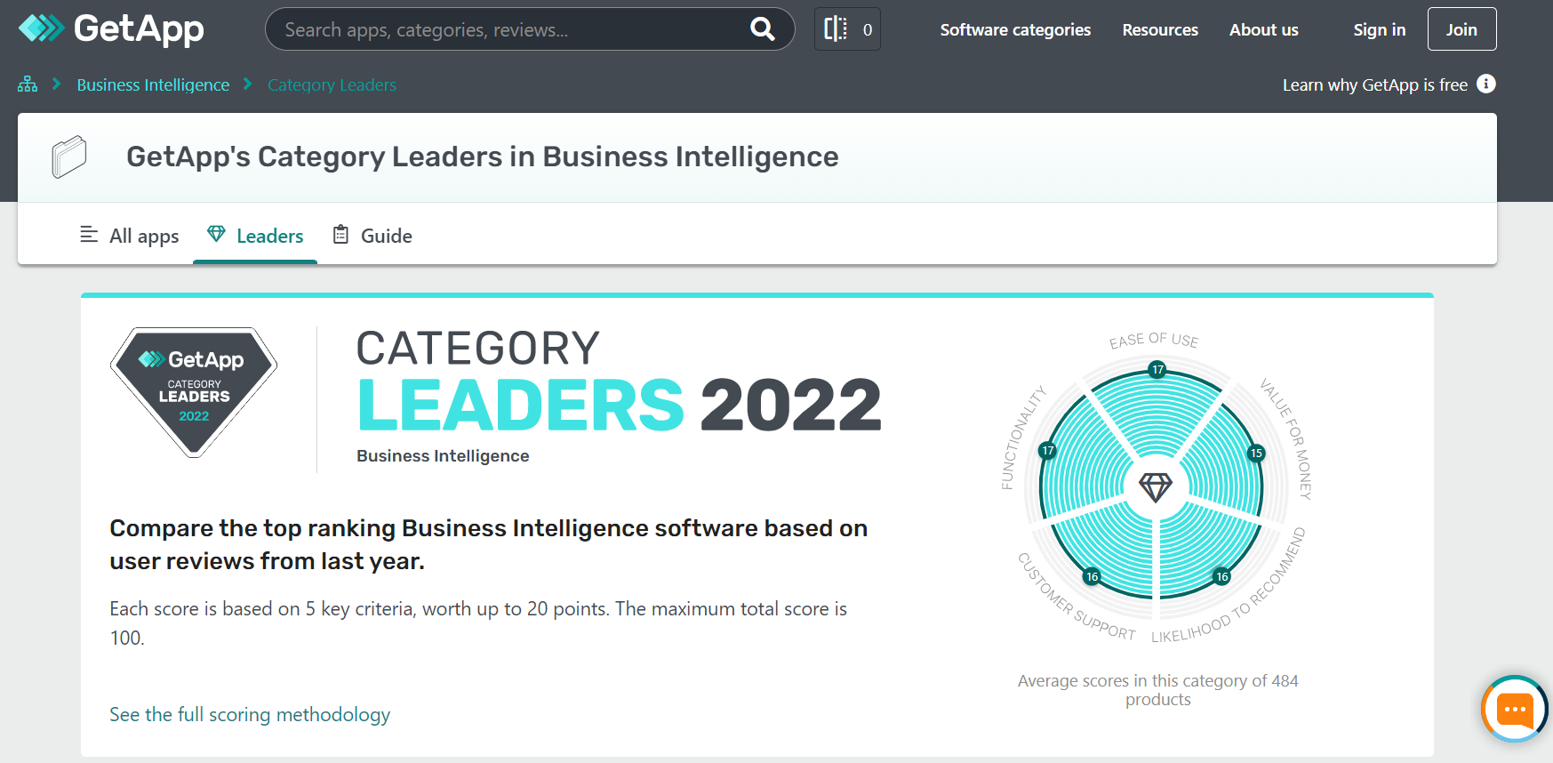
GetApp’s Category Leaders in Business Intelligence for 2022 (Source)
And if all this talk about interactive dashboards has you excited to learn more, we have you covered with our library of business intelligence resources. Here are a few recent articles to read next:
Sources
How To Create Stunning and Interactive Dashboards in Excel?, Analytics Vidhya
Note: The applications mentioned in this article are examples to show a feature in context and are not intended as endorsements or recommendations. They have been obtained from sources believed to be reliable at the time of publication.
As a seven-time award winner in the Maryland, Delaware, D.C. and Suburban Newspapers of America editorial contests, Andrew’s work has been featured in the Baltimore Sun and PSFK. He lives in Austin with his wife, son, and their rescue dog, Piper.
More on Business Intelligence