GetApp offers objective, independent research and verified user reviews. We may earn a referral fee when you visit a vendor through our links.
Our commitment
Independent research methodology
Our researchers use a mix of verified reviews, independent research, and objective methodologies to bring you selection and ranking information you can trust. While we may earn a referral fee when you visit a provider through our links or speak to an advisor, this has no influence on our research or methodology.
Verified user reviews
GetApp maintains a proprietary database of millions of in-depth, verified user reviews across thousands of products in hundreds of software categories. Our data scientists apply advanced modeling techniques to identify key insights about products based on those reviews. We may also share aggregated ratings and select excerpts from those reviews throughout our site.
Our human moderators verify that reviewers are real people and that reviews are authentic. They use leading tech to analyze text quality and to detect plagiarism and generative AI.
How GetApp ensures transparency
GetApp lists all providers across its website—not just those that pay us—so that users can make informed purchase decisions. GetApp is free for users. Software providers pay us for sponsored profiles to receive web traffic and sales opportunities. Sponsored profiles include a link-out icon that takes users to the provider’s website.
How To Unlock the Benefits of Dashboard Reporting
Digital dashboard benefits can make managing and understanding your business’s data much easier. The key is to find a dashboard that fits your needs and budget.


Digital dashboard benefits can make managing and understanding your business’s data much easier. The key is to find a dashboard that fits your needs and budget.
Data analytics doesn’t always have to mean crunching numbers and making charts by hand. For small businesses, this responsibility usually falls onto your shoulders, as the business owner or manager. The good news is that digital dashboards can make this easier by generating readable data visuals that can help you identify your business’s successes and areas for improvement.
“Dashboards” are digital tools that help you create digestible charts and graphs from complicated stats. The benefits you receive by using a dashboard, especially with their ability to manage data, makes them highly desirable across a variety of industries.
What is a dashboard?
A dashboard is a tool that provides visual representation of key performance indicators (KPIs) and other metrics. The information can be in the form of graphs, charts, or maps and with option for users to further drill down the data.
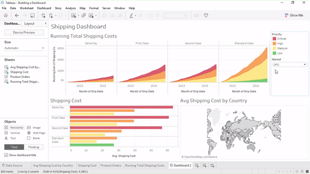
Dashboard in Tableau (Source)
Types of dashboards
Dashboards have become so useful that today most software solutions, such as BI, marketing, sales, or finance, use dashboards. Based on functions, dashboards can be broadly categorized as:
Operational: Operational dashboards reflect the ongoing processes of a business and updates frequently. They monitor the dynamics of key performance indicators (KPIs), which are helpful for managers or project leaders keeping track of their team’s successes and areas for improvement.
Strategic: Strategic dashboards are especially good at reporting the status of a metric for a defined period of time. They do not update as frequently as operational dashboards and are better suited for giving you the “big picture” without minute details. This is useful for department leaders and managers responsible for long term planning and making data-driven decisions.
Analytical: Analytical dashboards serve as quick visualization tools to identify trends and check historical performance. They are generally used by analysts and middle management to track how metrics have changed.
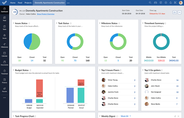
Dashboard in Zoho Projects (Source)
Key digital dashboard benefits
Dashboards are a great way to glean insights from raw business data without having to code personally. Some of the key benefits of using dashboards include:
Providing a unified view of key business metrics: Dashboards provide a single pane of visibility into all key business metrics. They serve as a central location for users to view and analyze up-to-date information.
Getting real-time updates: Any change in the underlying data or values is reflected in dashboards immediately. This helps you to identify fluctuations in key business metrics as soon as they happen without having to wait for daily or weekly reports.
Saving time and effort:Dashboards make data visualization easier and allow you to more easily parse through data. This means that you spend less time trying to make data points comprehensible so you can spend more time thinking about what the data means for your business.

Real-time data updates in Microsoft Power BI dashboard (Source)
3 tips to unlock dashboard benefits
Dashboards must be mindfully built to be beneficial. Well-designed dashboards can improve your productivity and save time, but poorly designed or cluttered dashboards can make it even more difficult to read the values and identify the right metrics.
Here are a few tips to keep in mind when building your dashboard:
Choose the right metrics to display:You might be tempted to add as many metrics as possible to the dashboard, but this will clutter your dashboard, make it slow, and make it difficult to share. Be selective and choose the most relevant metrics to be displayed on a dashboard. Use dashboard tabs or build separate ones if you must track many metrics.
Keep it simple:Your dashboard will be able to generate many types of charts and diagrams—but not all of these will make your life easier. Resist the urge to add tons of different types of charts, diagrams, colors, and fonts, and opt instead for simpler dashboard diagrams that are easy to read and help users digest the information. It might take a few months to figure out which types of charts and diagrams are most helpful—don’t be afraid to change it up.
Make it interactive: Allow options to filter and drill-down data as per user requirements. This will help ensure maximum benefit for a broad range of users.
Find your dashboard match on GetApp
If you haven’t found the dashboard for you, let us help you search for and compare options. You can get started by comparing the top 4 analytics platforms with dashboards that received the highest average customer ratings on GetApp’s dashboard directory. Click on each product name to learn more about their features and pricing, read customers reviews, and platform alternatives that might be worth checking out.
Visit our:
Toby Cox
More on Business Intelligence