

GetApp offers objective, independent research and verified user reviews. We may earn a referral fee when you visit a vendor through our links.
Our commitment
Independent research methodology
Our researchers use a mix of verified reviews, independent research, and objective methodologies to bring you selection and ranking information you can trust. While we may earn a referral fee when you visit a provider through our links or speak to an advisor, this has no influence on our research or methodology.
Verified user reviews
GetApp maintains a proprietary database of millions of in-depth, verified user reviews across thousands of products in hundreds of software categories. Our data scientists apply advanced modeling techniques to identify key insights about products based on those reviews. We may also share aggregated ratings and select excerpts from those reviews throughout our site.
Our human moderators verify that reviewers are real people and that reviews are authentic. They use leading tech to analyze text quality and to detect plagiarism and generative AI.
How GetApp ensures transparency
GetApp lists all providers across its website—not just those that pay us—so that users can make informed purchase decisions. GetApp is free for users. Software providers pay us for sponsored profiles to receive web traffic and sales opportunities. Sponsored profiles include a link-out icon that takes users to the provider’s website.
10 Different Types of Charts and Graphs
Charts and graphs can make it easy for you to display your data, but how do you choose the one that’s best for your needs? Learn how to choose graphs and charts that create value and build reader understanding.


Whether you're an in-house marketer tracking sales or a business intelligence analyst evaluating policy impacts, you know that visualizing data the right way can make a huge impact.
With so many options for charts and graphs, how do you choose the right one for your needs? Get familiar with these 10 different types of charts and graphs commonly used in marketing and business operations to know when—and how—to use them.
What are the different types of charts?
Charts and graphs can help you visualize a wide variety of business data including performance metrics and marketing campaign success. However, each chart and graph lends itself to a specific purpose. That's why it’s important to understand how each chart should be appropriately used.
| Type of chart | Best used for |
|---|---|
| Bar graphs | This chart type (sometimes called column charts) allows you to compare numeric values for two data points and is best for presentations where you must present basic data, like customer shares by age. |
| Flow charts | These charts show the pathway of a process and are best for illustrating how a decision is made. Flow charts can show internal processes (e.g. recruitment) or external processes (e.g. customer decision-making cycle). |
| Dual-axis charts | Dual-axis charts look similar to bar graphs, but they're used to plot three data points instead of two. You'll see both bars and a line graph on these data charts, which are useful for looking at how two different factors (such as income level and education level) affect one metric (e.g. overall sales). |
| Bullet charts | These charts are used to show how well your organization is performing regarding a certain goal or target. They're ideal for showing whether teams are on track to hit targets. |
| Pie charts | You're probably familiar with pie charts, which visualize percentages of a whole. These charts are great for showing how a marketing budget is being used. |
| Gantt charts | Project managers often use Gantt charts, which show the schedule for completion of all project-related tasks. Use these vertical charts to present a timeline for overlapping tasks. |
| Mekko charts | One of the most useful types of charts, a Mekko (or Marimekko) graph compares different values while showing the individual makeup of each. These charts are helpful for things like comparing market share across your company's different product or service areas. |
| Scatter plots | These two-axis plots compare the effects of two variables on one value. They can be used when you need to visualize a lot of data or identify outliers. |
| Waterfall charts | These charts look similar to bar graphs, but they can be used to show both negative and positive values. Waterfall charts show data such as changes in profits and losses over time. |
| Funnel charts | True to their name, funnel charts use an inverted triangle to show the different steps in a process. They're a staple for demonstrating metrics like sales funnels and website conversions. |
What are the advantages and disadvantages of each type of chart?
It's not possible to choose the best chart for your project unless you know the benefits and drawbacks of your options. For example, you might need to make a profit-and-loss chart that's easy for key stakeholders to analyze—a waterfall chart would be effective. Maybe you want to demonstrate bottlenecks in a manufacturing process that BI tools have identified—a funnel chart is the perfect choice. Digging into the advantages and disadvantages of different chart types will help you make the best decision.
Bar graphs
These basic charts are among the most widely used because readers are familiar with them, and they are easy to create.
| Advantages | Disadvantages |
|---|---|
| Best for showing the relationship between one outcome and one or more variables, such as how education level affects buying decisions for a small business's customers. | Not ideal for showing nuanced data or trends in data, such as changes in sales over time. |
| Can display basic data in a straightforward format that is easy for even business novices to understand. | Can show multiple variables, but only how they affect one outcome. |
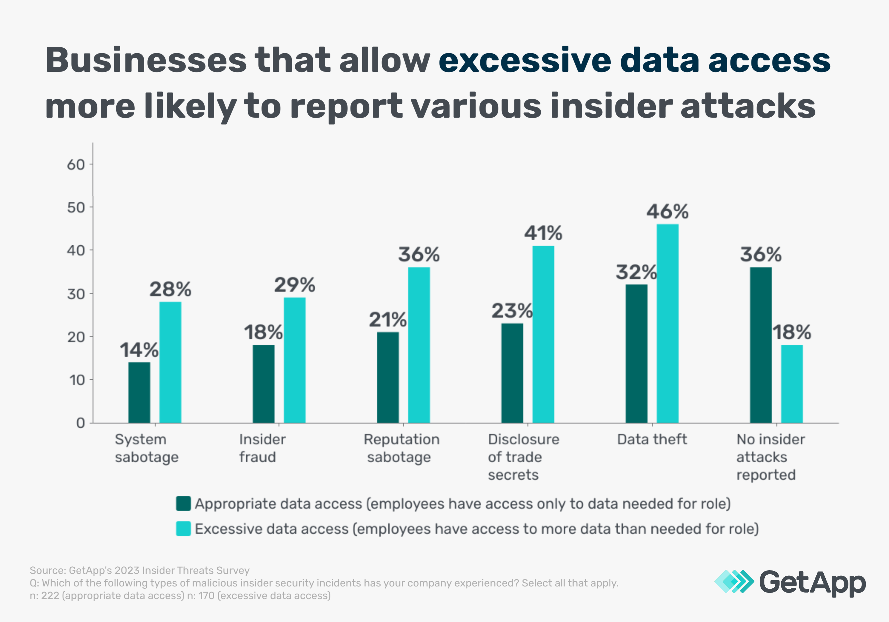
An example of a bar graph that shows the relationship between two variables [1]
Flow charts
These chart types are designed to show the pathway for a process or making an informed decision and are widely used in the customer service and manufacturing industries.
| Advantages | Disadvantages |
|---|---|
| It is a great way to demonstrate processes or decision pathways, building clarity. | Track one process at a time and cannot show the relationships between multiple processes. |
| Break down steps in a process in order to pinpoint and eliminate inefficiencies. | Requires time, careful construction, and sometimes revisions for first-time creators. |
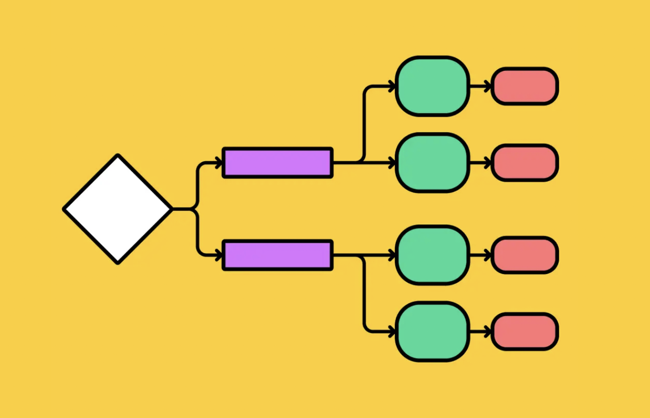
An example of a basic flowchart [2]
Dual-axis charts
Dual-axis charts use both bars and lines to demonstrate the relationships between different variables and effects.
| Advantage | Disadvantage |
|---|---|
| Allow you to see how different data is correlated, such as how two unrelated variables like customer age and sales staff education impact one variable, like quarterly sales. | It can be difficult to interpret, especially when the lines for two variables intersect — viewers may not understand that the variables are only related to one outcome and not to each other. This can make dual-axis charts seem misleading. |
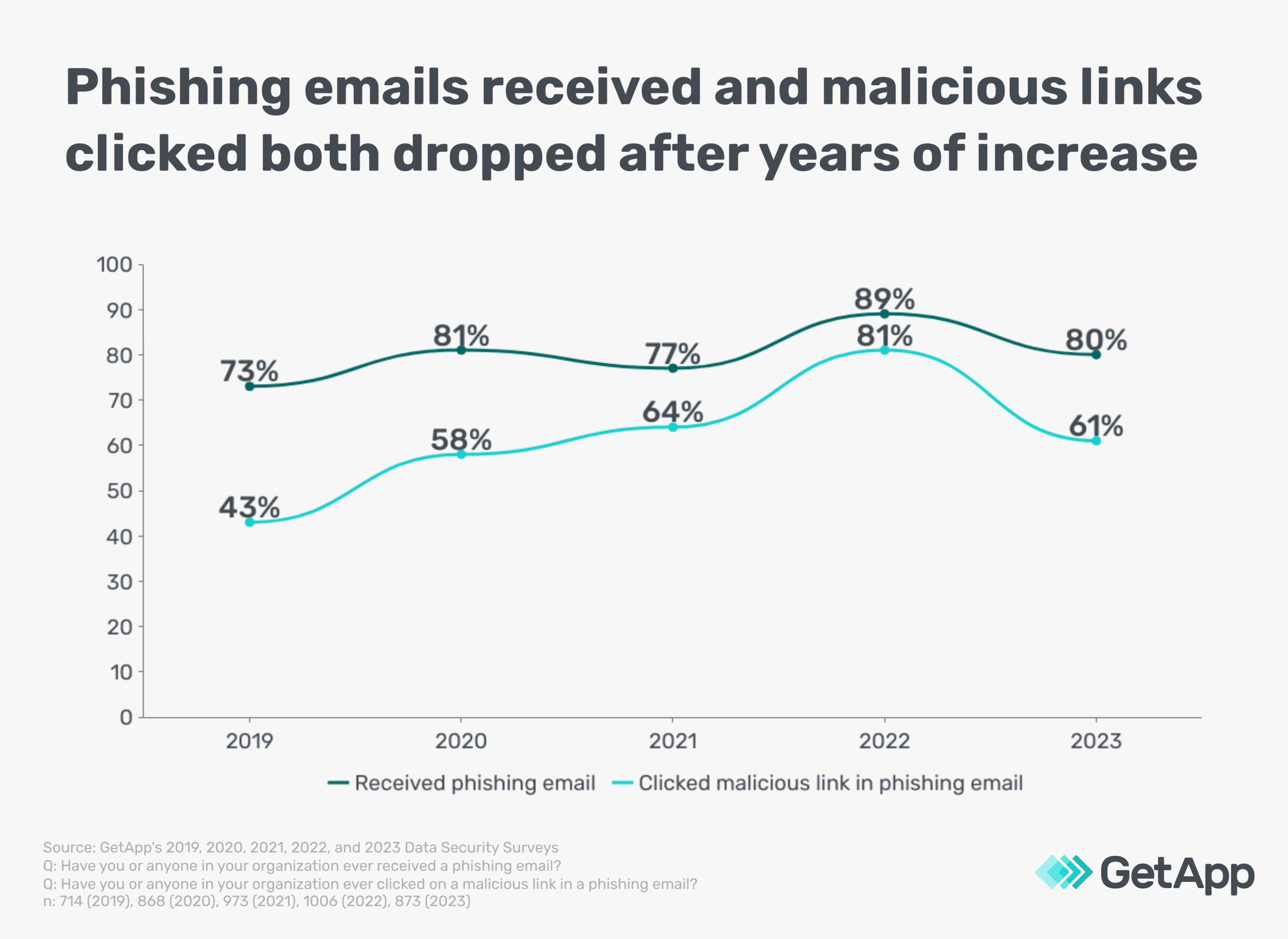
An example of a dual-axis chart [1]
Bullet charts
Used for tracking progress towards goals and benchmarks, these graph types are especially helpful for determining the success of corporate initiatives or campaigns.
| Advantages | Disadvantages |
|---|---|
| Clearly show progress towards goals and can be used to track progress according to date, sales, or any other metric you need to use. | Cannot be used to track how variables affect goal progress. For instance, it can't show how employee sick days have affected target project completion dates. |
| Helpful for tracking the progress of individual campaigns. | Can be confusing or overwhelming if used to track the progress of two different campaigns or initiatives due to data overload. |
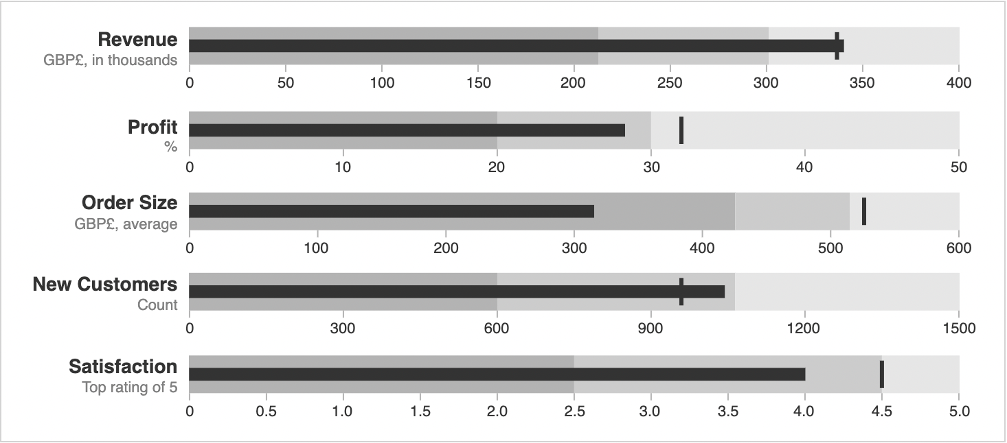
An example of a bullet chart [3]
Pie charts
Pie charts have long been used in both business and academic settings to communicate information about the composition of a single number, like overall government spending.
| Advantages | Disadvantages |
|---|---|
| A simple way to show what a different value, like a non-profit organization's operating fund, consists of. | Can't show changes in the makeup of a variable over time. For instance, a pie chart is unable to show how donations for a non-profit have changed over time. |
| Great for showing simple value breakdowns that you don't want to relate to different variable or market factors. | May appear visually cluttered if there are many different sources contributing to one value. For instance, if there are 30 different donor categories, a pie chart may be visually overwhelming or useless. |

An example of a pie chart [4]
Gantt charts
Project managers worldwide rely on Gantt charts to help them plan and track the progress of individual projects.
| Advantages | Disadvantages |
|---|---|
| Ideal for showing projects at a glance and sharing key completion dates and other targets. | Can be time-consuming to make and will need to be updated as project priorities or time-related targets change. |
| Allow for comprehensive project tracking with flexibility for changes over time. | Can only cover projects at a macro-level, otherwise these charts can appear complex and overwhelming. |
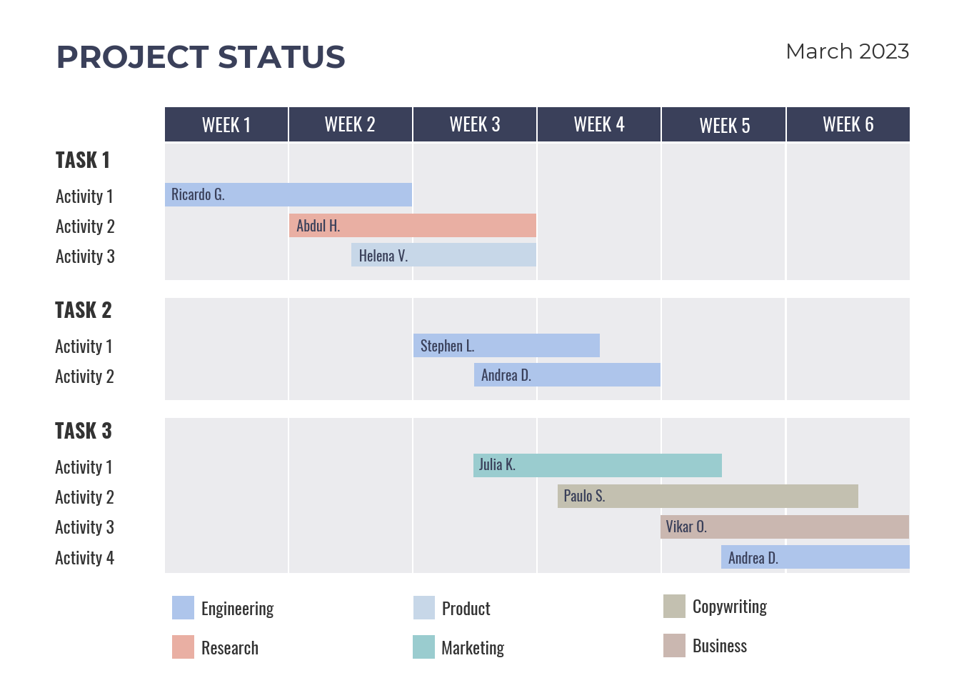
An example of a Gantt Chart [5]
Mekko charts
Mekko charts are an excellent alternative to pie charts that allow for comparing the makeups of different sets of values in one graph.
| Advantage | Disadvantage |
|---|---|
| Effectively visualize and compare the makeup of different values, such as which customer shares account for the overall sales or profits of your company versus competitors. | Not ideal for large amounts of data because these charts can become visually crowded and difficult to read. |
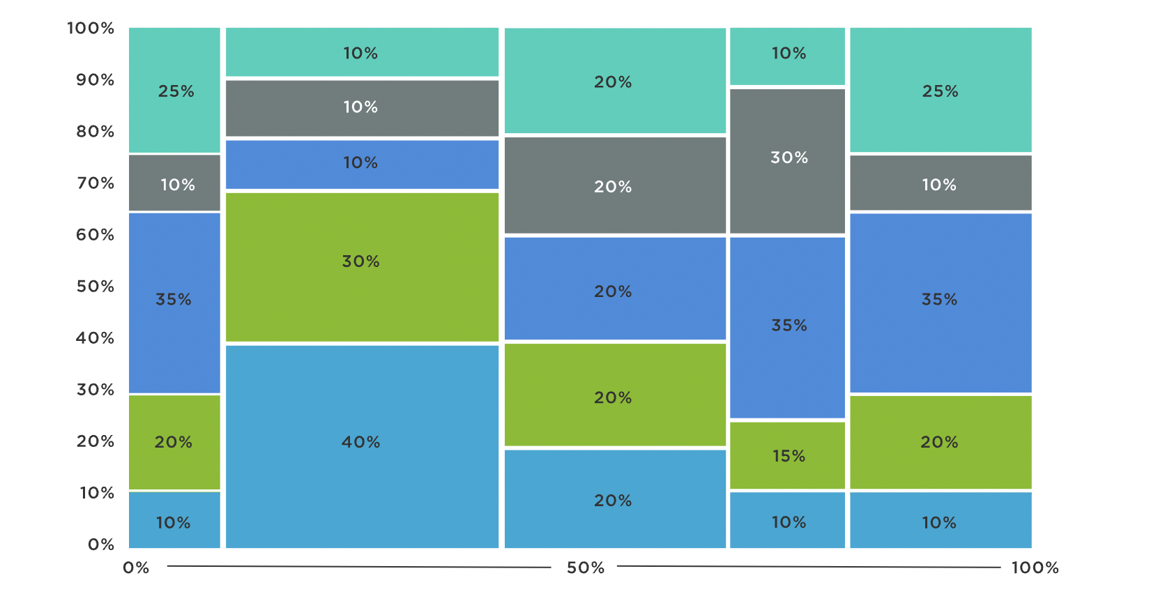
An example of a Marimekko (Mekko) Chart [6]
Scatter plots
Used for finding patterns and discrepancies in large data sets, scatter plots are found in a variety of industries from marketing, science, and law.
| Advantages | Disadvantages |
|---|---|
| Ideal for finding outliers in a data set and either highlighting or eliminating them. | Do not display exact values for each data point, leaving viewers to make assumptions or judgements that may be incorrect. |
| Make it easy to spot patterns in something, like customer satisfaction according to age and other demographics. | They can only show two variables, so may not effectively capture all the factors that impact a multi-faceted metric or KPI. |
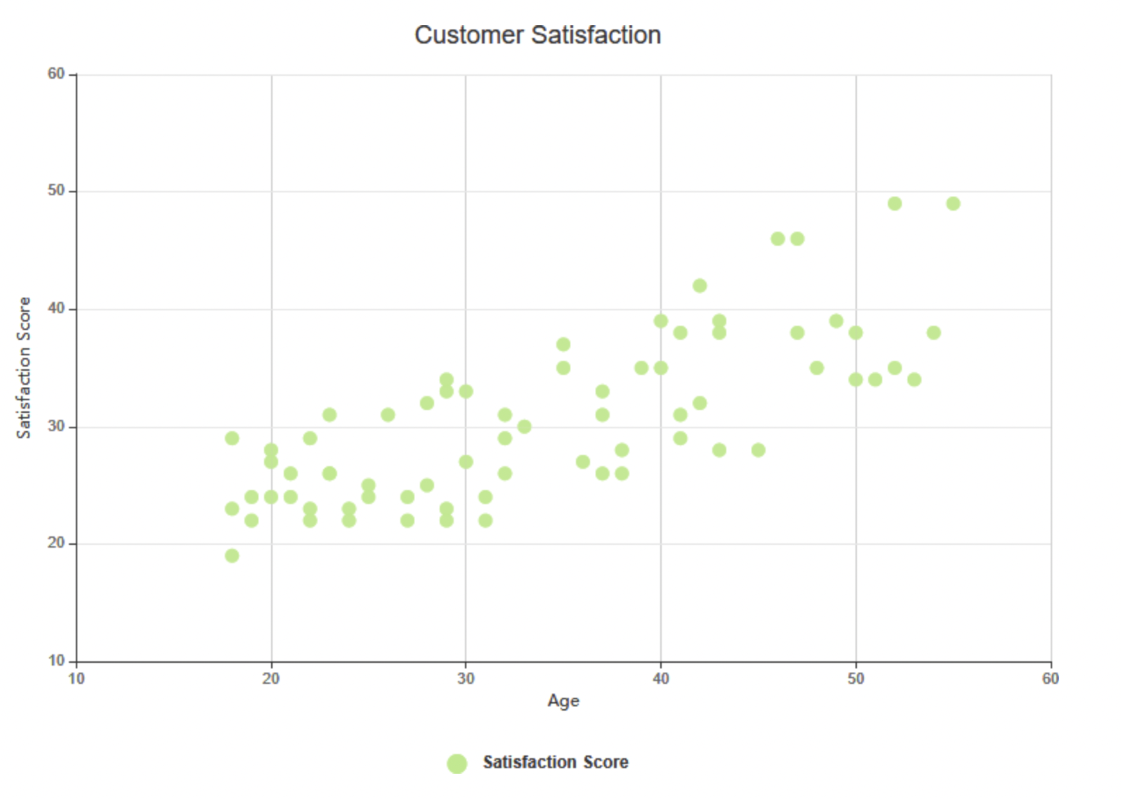
An example of a scatter plot [7]
Waterfall charts
Sometimes called bridge charts or cascade graphs, waterfall charts are used when it's essential to communicate both positive and negative values in one graphic.
| Advantages | Disadvantages |
|---|---|
| Show transformations and changes visually, making them a great way to track profits and losses or changes to a business's budgeting priorities. | Bar lengths may be misleading because they do not all “grow” from a common value of 0 and cannot be easily compared to adjacent bars. |
| Ideal for tracking how many different factors, such as a variety of SEO approaches, impact one value like overall marketing budget. | It can be difficult to read due to issues with misleading bar lengths or poorly identified values. |
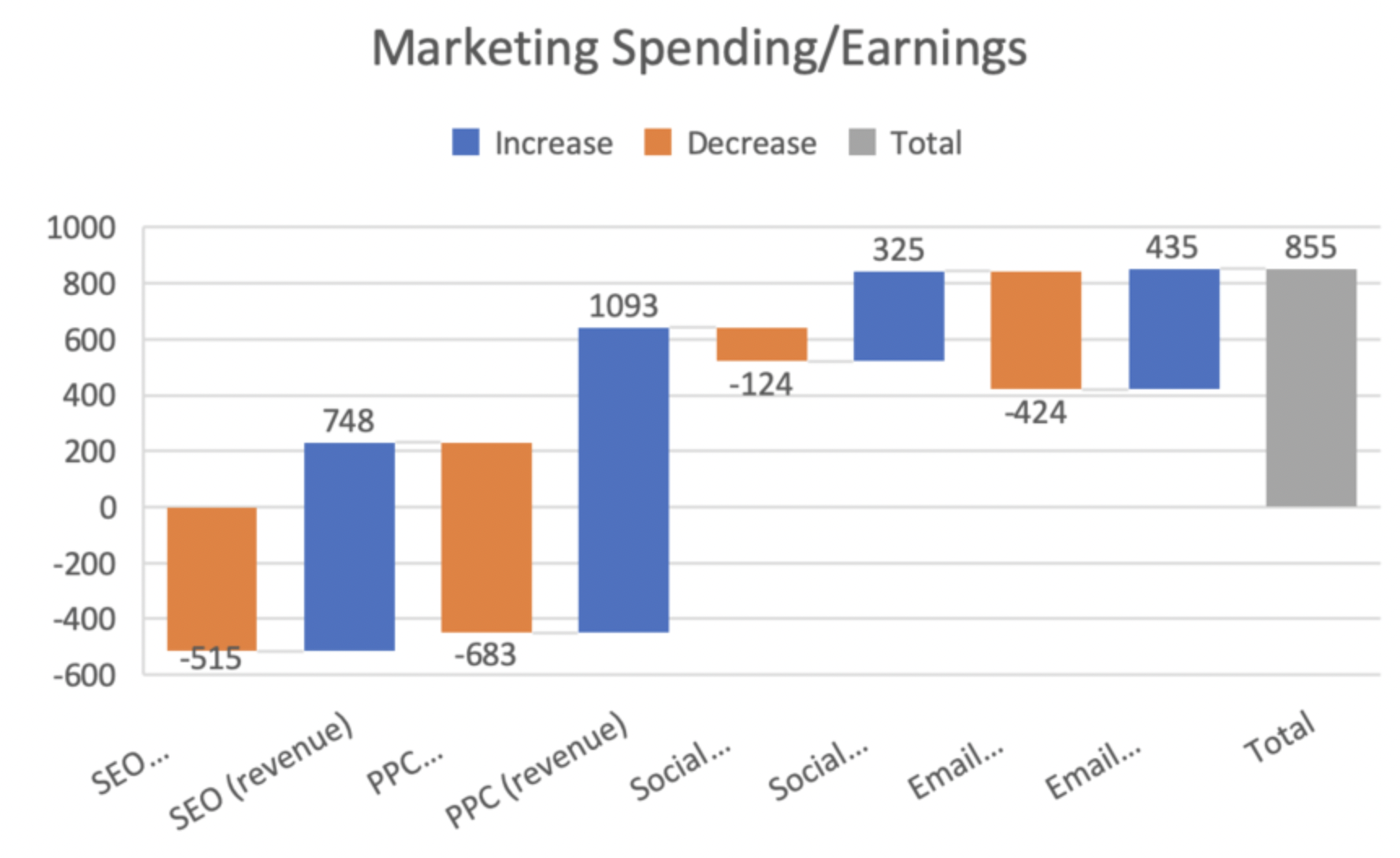
An example of a waterfall chart [8]
Funnel charts
Funnel charts use an inverted triangle format to track processes in both manufacturing and decision-making.
| Advantages | Disadvantages |
|---|---|
| Easy to read and offer a visual layout that clearly demonstrates losses in efficiency during the course of a process. | Can only represent one process, such as a manufacturing business's process for creating one particular product. |
| Great for identifying bottlenecks in processes, especially when manufacturing professionals are having difficulty identifying the specific factors holding up production. | Look cluttered when more than seven steps are included, making them harder to use for identifying bottlenecks or other process errors. |
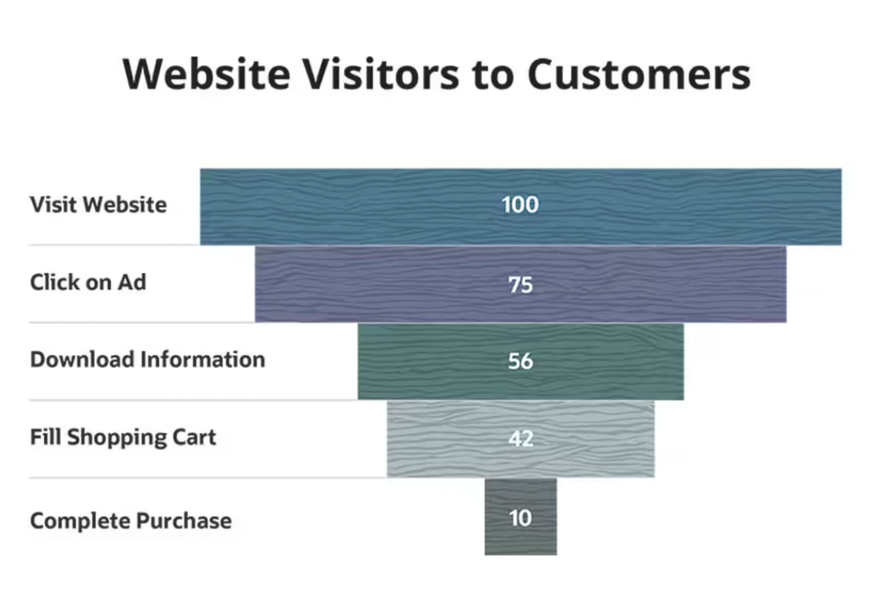
An example of a funnel chart [9]
How to choose the right type of chart for your data?
You want to make an effective chart for a presentation, but what type of graph do you use? Ask yourself these three questions:
What kind of data do I want to display?
Which charts and graphs can be used to display that data?
Which potential charts will be the most persuasive or easiest for my audience to understand?
What are some best practices for creating charts?
There are a few graphing best practices you should follow when creating charts. They help you ensure your graphs are useful, readable, and accurate.
Use data visualization software to help identify the right data to include in your charts
Double-check your data for accuracy
Choose the simplest type of chart that can be used to display your data
Incorporate white space to make your charts easier to read
Use the full axis if your graph has one
Clearly label all variables and values
Ask colleagues for feedback before you present your chart
How to use charts to communicate your findings effectively
Remember that simplicity is key when you want to communicate data. Make it easy for your audience to understand why you're using charts and what information they can get from them. If you use multiple data charts or graphs in one presentation, ensure they look visually similar. Using the same color schemes and fonts is an effective way to incorporate multiple charts into one project.
Remember to provide contextual information for your graphs: A chart can illustrate values and variables, but only you can tell the stories behind the numbers.
Ready to learn more about charts, graphs, and data organization? Explore these resources.
Sources
GetApp’s 5th Annual Data Security Report: U.S. Businesses Gaining Ground Amid Ongoing Threats, GetApp
Bullet Graph, Data Visualization Catalogue
4 Major Data Privacy Disconnects Between Marketers and Consumers-and How to Bridge the Divide, GetApp
What is a Marimekko Chart?, Jaspersoft
What is Scatter Chart?, Visual Paradigm Online
Dorothy Bond
More on Tech 101


Nov 03, 2023
Dec 18, 2023

Oct 31, 2023