

GetApp offers objective, independent research and verified user reviews. We may earn a referral fee when you visit a vendor through our links.
Our commitment
Independent research methodology
Our researchers use a mix of verified reviews, independent research, and objective methodologies to bring you selection and ranking information you can trust. While we may earn a referral fee when you visit a provider through our links or speak to an advisor, this has no influence on our research or methodology.
Verified user reviews
GetApp maintains a proprietary database of millions of in-depth, verified user reviews across thousands of products in hundreds of software categories. Our data scientists apply advanced modeling techniques to identify key insights about products based on those reviews. We may also share aggregated ratings and select excerpts from those reviews throughout our site.
Our human moderators verify that reviewers are real people and that reviews are authentic. They use leading tech to analyze text quality and to detect plagiarism and generative AI.
How GetApp ensures transparency
GetApp lists all providers across its website—not just those that pay us—so that users can make informed purchase decisions. GetApp is free for users. Software providers pay us for sponsored profiles to receive web traffic and sales opportunities. Sponsored profiles include a link-out icon that takes users to the provider’s website.
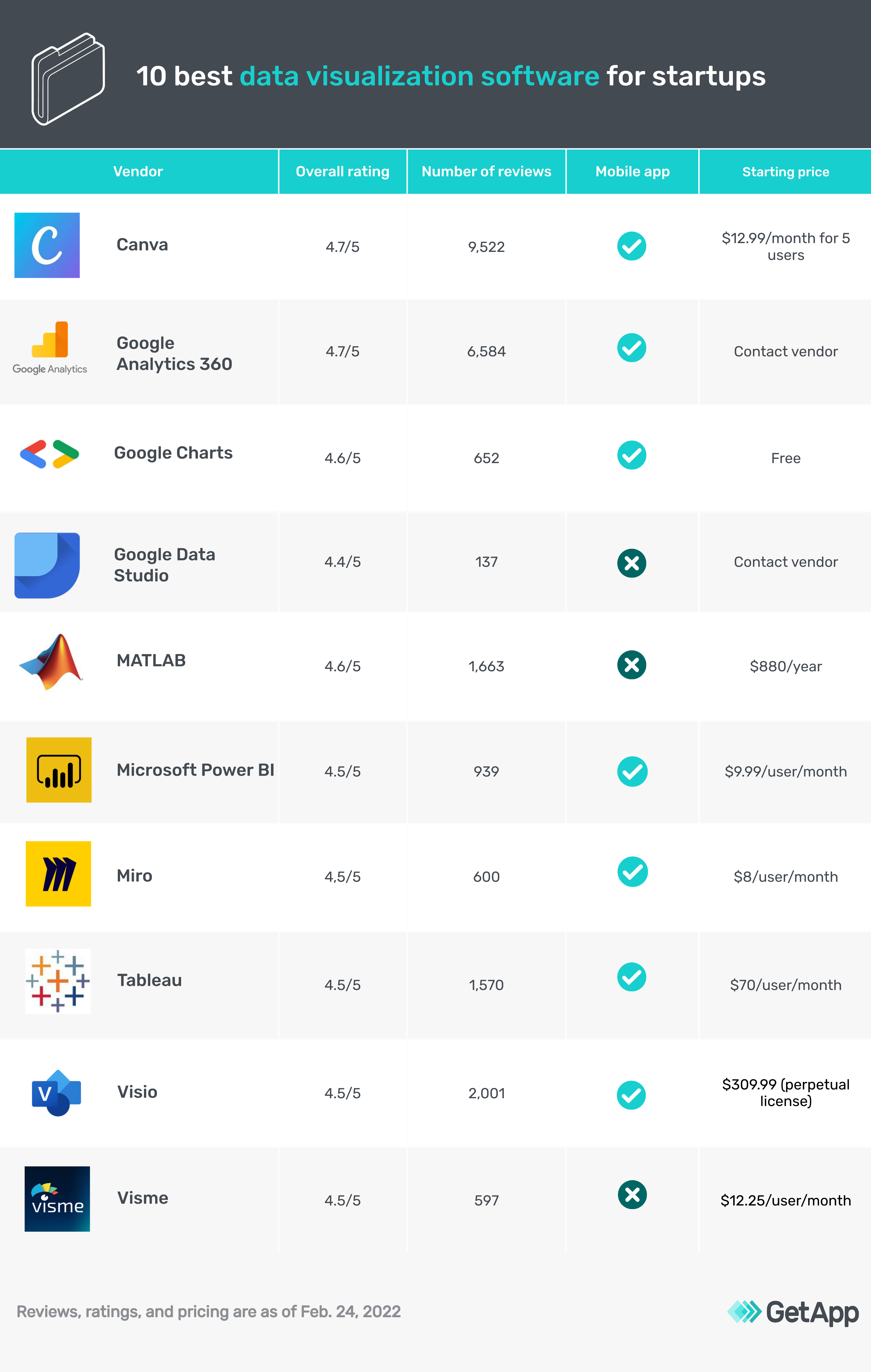
10 Best Data Visualization Tools for Startups
Presenting data in a simple, understandable manner is key to your success. Here are 10 top data visualization tools that can help you do just that.


Data is at the heart of almost every activity for both established businesses and startups. From data analysts to marketers, everyone uses data to accomplish tasks such as analyzing business trends and segmenting website visitors to identify target audiences.
However, merely collecting data is not enough. You need to understand it, present it clearly to your team, and use the insights you gain to guide your business decisions.
This is where data visualization tools come in handy. These tools help you present data visually through graphs and charts, making it easy to convey complex information.
To help you find the right tool, we compiled this list of 10 top data visualization software options based on reviews from users just like you (tools listed alphabetically; you can find our methodology at the bottom of this page).
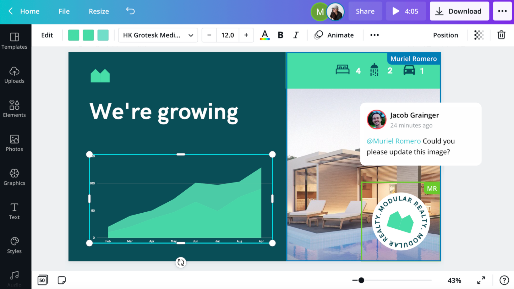
Canva
Canva is a graphic design and data visualization tool where users can create infographics, charts, and presentations to share data and complex information.
The software has a graph maker where you can create custom graphs and charts. You can also access a pre-built template library to work with ready-made designs.
With an easy-to-use drag-and-drop editor, you can add and change multiple elements and components on your charts, such as icons, visuals, fonts, and colors.
Once you've added data to a chart, you can switch to a different chart without losing any of your data. Canva lets you download your charts and graphs in high quality and embed them in presentations and reports.
Canva offers chat and email support. It is cloud-based and has applications for desktop and mobile (iOS and Android) devices.
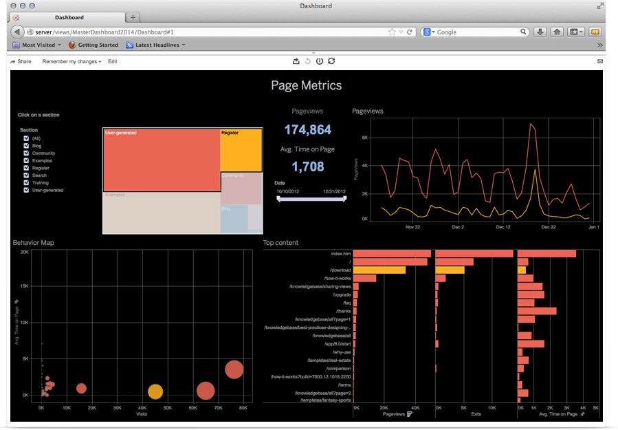
Google Analytics 360
Google Analytics 360 is an analytics platform that helps users uncover performance indicators and create analysis reports.
This software analyzes website visitors and app users to track their online behavior and help you better understand your customers. With its reporting feature, you can understand how your customers interact with your website, create reports for a specific period, geography, or audience type, and share these insights with teammates.
Google Analytics 360 also keeps track of your social media performance and the online impressions your business receives. This software can help track ad campaigns and performance indicators such as engagement and conversion rates.
Google Analytics 360 offers chat, email, and phone support. The software is web-based and has a mobile app for Android devices.
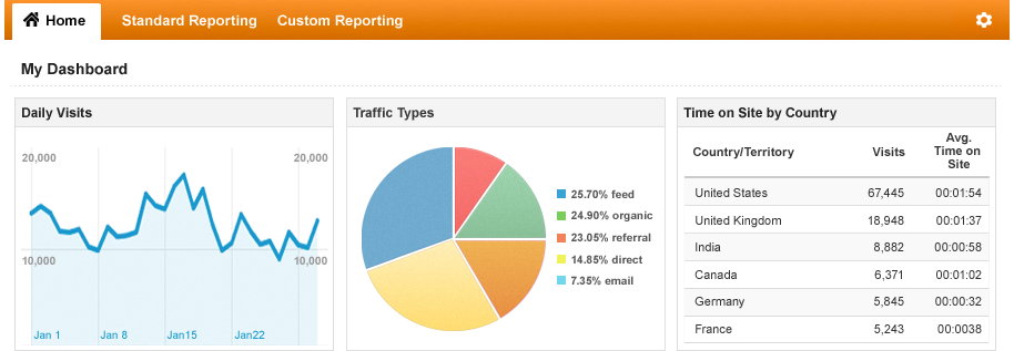
Analyzing daily visits in Google Analytics 360 (Source)
Google Charts
Google Charts is a data visualization solution that helps businesses manage and visualize data as pie charts, pictographs, and histograms.
The software offers a chart gallery that lets you access various interactive chart types, including line charts and hierarchical treemaps. Google Charts also features a customizable dashboard to manage multiple charts.
With cross-browser compatibility, you can access Google Charts on new and old browsers and save your data across all devices. The software also features a control dashboard to connect all of your charts that you can access from anywhere.
Google Charts offers a guidebook and documentation as support. The software is web-based and has a mobile app for Android and iOS devices.
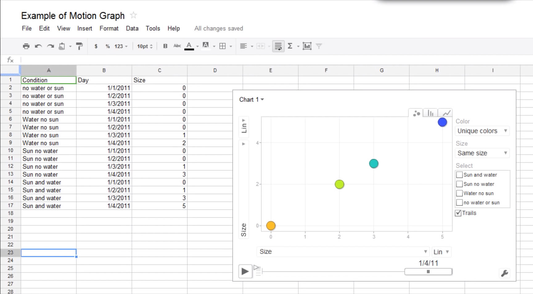
Viewing a chart in Google Charts (Source)
Google Data Studio
Google Data Studio is a data visualization platform where users can create interactive dashboards and professionally styled reports.
This software allows you to store large amounts of data and connect with multiple data sources. You can extract raw data from a data source to enrich your presentations and reports. You can also create automated data dashboards that self-update as you add new data.
Google Data Studio helps you organize your data using pre-built data connectors such as engagement, sale metrics, and user demographics.
You can easily share the dashboards you create with teammates to facilitate collaboration and information-sharing. Moreover, you can add analytics data to your dashboard to measure and analyze the performance of your digital marketing campaigns.
Google Data Studio offers email support. The software is web-based.
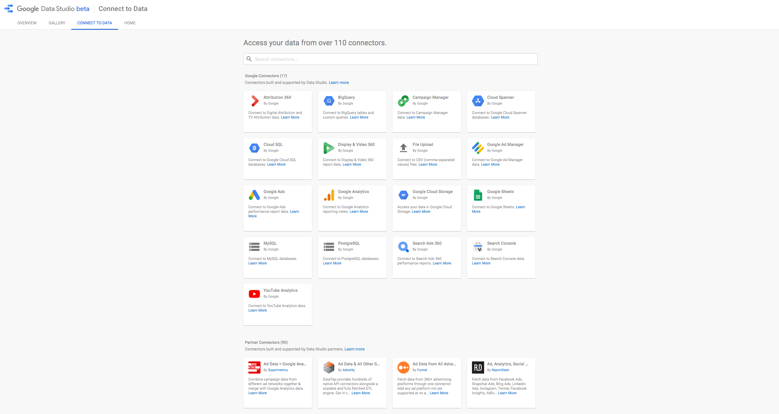
Data connectors in Google Data Studio (Source)
MATLAB
MATLAB is a programming and numerical computing platform that businesses and educational institutions use to create information models, develop algorithms, and analyze datasets.
You can use MATLAB to analyze complex datasets from diverse fields such as climatology, predictive maintenance, medical research, and finance. This software allows users to visually represent complex information using a customizable data dashboard.
You can organize your data by type, such as tabular, time-series, categorical, and textual data. Additionally, you can use the MATLAB language to write programs that help customize visualizations and maintain them even when new data is added.
MATLAB offers chat support. The software is web-based.
Microsoft PowerBI
Microsoft PowerBI is a suite of data analytics and business intelligence tools for analyzing business data and sharing insights via visualizations.
This software lets you work on customizable and pre-built dashboards to unify important metrics into single views, showing real-time updates on key business metrics.
Additionally, you can prep and model your data with built-in modeling tools and use advanced data analysis features such as quick measures, grouping, forecasting, and clustering to search for patterns in the data that provide actionable insights.
This business intelligence tool also provides AI-driven augmented analytics powered by machine learning, which automates the process of finding insights from the data you feed into the system. Once you have key insights, you can create reports using a drag-and-drop canvas and build data visuals for presentations.
Microsoft Power BI offers email support. The software is web-based and has a mobile app for Android devices.
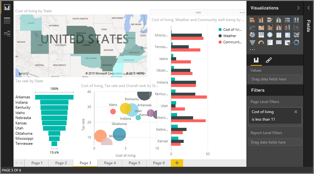
Visual reporting in Microsoft Power BI (Source)
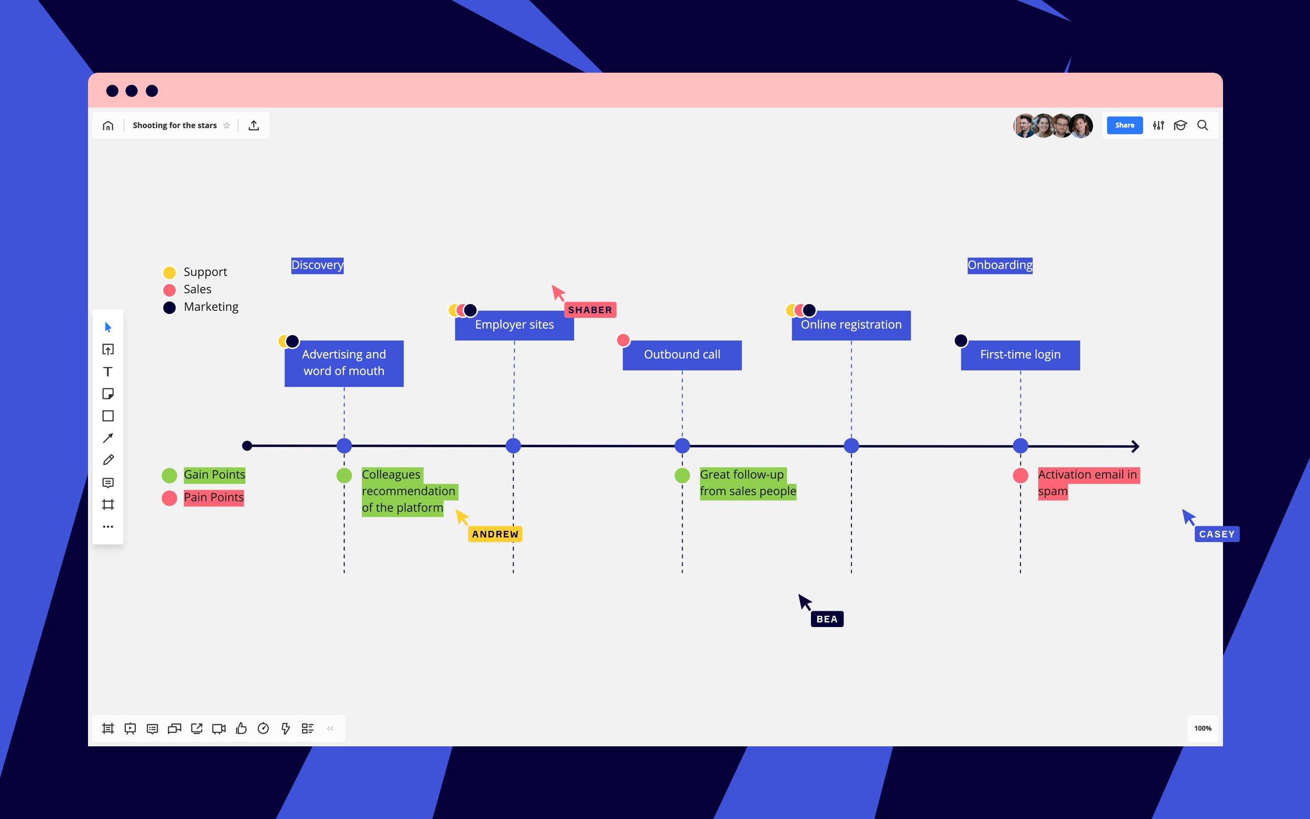
Miro
Miro is an online collaborative whiteboard platform that helps distributed teams come together, brainstorm, share and present information and data, and manage projects using agile workflows.
This software provides a digital whiteboard with sticky notes that you can use to pin ideas, conversations, and product roadmaps with your team. You can build customer journeys and collaborate with cross-functional stakeholders to visually explain how each step of a project works and assign tasks to individual members of your team.
With sprint planning and huddle boards, your team can effectively distribute work and keep track of project status on a shared dashboard. You can also strategize and plan future projects using the whiteboard and oversee capacity building for all team members.
Miro offers chat and email support. The software is web-based and has a mobile app for Android and iOS devices.
Tableau
Tableau is a data analytics platform that helps users find patterns and build meaningful connections in their datasets.
With Tableau, you get a customizable drag-and-drop interface to create data visualizations, interactive reports, and dashboards showcasing variable data that changes over a specified period. With the data visualization tool, you can uncover business insights and find gaps to improve performance.
Tableau features 67 data connectors that you can use to source data from virtually anywhere, including virtual drives, PDFs, cloud-based repositories, and third-party applications.
This software also keeps your data safe with a set of highly intensive security protocols and SSL encryption. You can also manage users and access permissions from the security dashboard.
Tableau offers chat, email, and phone support. The software is web-based and has a mobile app for Android and iOS devices.
Visio
Visio by Microsoft is a flowchart and diagram creation solution designed to aid collaboration and connect real-time data with business workflows.
This software enables the communication of complex information through data-linked diagrams, flowcharts, organizational charts, and floor plans. Visio offers a range of pre-built templates that you can modify and customize depending on your business needs.
You can use Visio for data visualization and brainstorming with your teammates. Users can collaborate with teammates, create common diagrams, and gather insights from each member. Visuals can be edited and updated in real time and embedded in data dashboards for presentations.
Visio offers chat, email, and phone support. The software is web-based and has a mobile app for Android and iOS devices.
Visme
Visme is a graphic design and data visualization tool where users can create interactive presentations and infographics to showcase data.
This software offers an editing dashboard that lets you create graphs and charts from scratch to visually showcase statistics and figures. Visme offers multiple pre-built templates and data widgets you can use to create interactive reports.
Users can animate their reports and make dynamic visuals that show changing data, such as forecasting models. Additionally, you can integrate Visme with your social media accounts and share your assets directly to third-party platforms.
Visme is web-based and offers email, chat, and phone support.
How to choose the right data visualization software for your business
Choosing the right data visualization tool for your startup can be tricky, but considering the following can help ensure you select a solution that meets your needs:
Check the types of visualization the software offers: Does the software only provide one visualization technique such as static presentations, or does it also let you create graphics? An ideal tool will help you build customizable and functional reports while offering multiple visualization options.
Consider your team's expertise and how you will integrate tools: Based on your team's technical expertise and the field you work in, choose a solution that your team can navigate and that integrates well with your existing tools.
Assess the tool's data connectivity: A good data visualization solution can connect with multiple data sources to extract crucial raw data. Choose a tool with robust data connectivity to avoid data gaps or collection issues.
Look for features such as animation and dynamic data: An ideal solution will always go beyond static graphs and charts and let you animate certain sections of your reports to make them more interactive. When selecting a tool, assess whether it offers multidimensional visualization, animation, and actionable alerts.
Questions to ask software providers when selecting data visualization software
These are some common questions you can ask software providers before making your final purchase:
How robust is customer support? Data visualization software can sometimes have issues with connectivity and data migration. In such cases, you need an effective and accessible customer support team to help you with such obstacles.
How customizable is the software? Your software should help you create custom reports to measure key business metrics and provide custom filters to view select data.
Is my data secure? Does the software in question have the necessary SSL encryptions and security compliance to protect against data leaks? Data security should be a key component of product selection.
Want to see more options? Check out our data visualization software directory on GetApp.
Methodology
For this article we selected the top 10 products with the highest ratings as of February 24, 2022 that met the following criteria:
Had at least 20 reviews from companies with <10 employees over the past two years with an average overall rating of 3 and above.
Met our market definition for data visualization software "Data visualization software lets users represent data via charts, graphs, sunbursts, and other visual forms of communication. These visualizations are intended to be shared with colleagues and stakeholders to help teams make more well-informed business decisions."
Had to offer the following core features:
Custom dashboards
Custom reports
Dataset management
More on IT Management


Aug 08, 2024


Sep 18, 2024

May 29, 2024